Kj&Co. 2024 Rebrand
Tags: Branding
Tags: Branding

Spring/Summer 2024
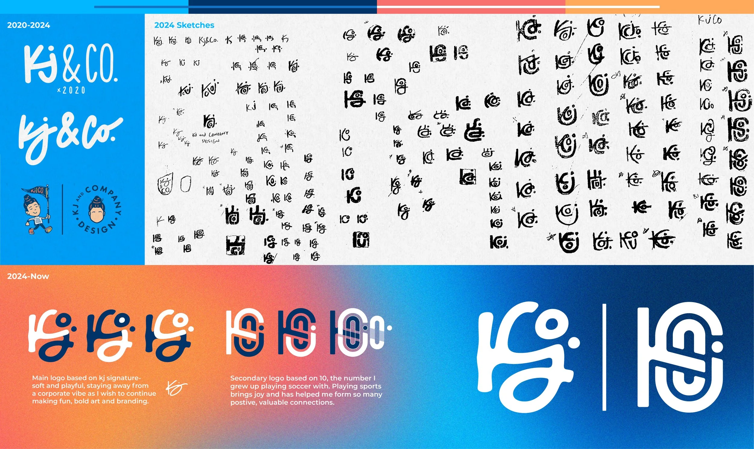
Goal: Lock in a new logo for my own brand that aligned better with the style I was aiming to develop- Something that’s simple, scalable, and able to uniquely combine all the separate letters/elements into one bold mark.
⸻
I thought I had this figured out in February ‘24, but something about what I’d come up with just wasn’t sitting right. I took some steps back as I worked on other projects and revisited this in April. That’s when several pages of sketches came to be. I cranked out a few on Illustrator that I was way happier with and ended up going with the two I use today.
⸻
Main Logo:
• Clean, soft, and playful- based off of my Kj signature while also sneaking the “Co.” in there
Secondary Logo:
• Unintentional at first, but lucky in the end- this secondary mark combines all the KjCo. letters and also can be seen as a number 10, which was my number in soccer for many years. Soccer has been and still is a major part of my life, so this nod to it felt right to keep around and use occasionally.
⸻
Colors & Vibe:
• Bright blue (favorite color), accented by a royal blue with navy as the darkest color of the set. Sunset orange and pink bring the warmth. Fun and familiar to me was the theme here.
• Grainy backgrounds and grain overlays on photos gives a film feel. Film is magical, film is nostalgic, film is warm and inviting. In a world where digital perfection is more and more achievable, I want to be a designer who’s not afraid of embracing certain slight imperfections and soft edges that show that a human left their mark on the project.